Author: Hanna Hagenmalm
Team: Leviathan
Concept: Draxl’s Journey
The past two weeks I have spent designing the user interface (UI) for the game.
A cluttered, dense user interface can be difficult to navigate. For new gamers, who might not be accustomed to interpreting the information presented by a game, and for people with some form of visual impairment, it might become overwhelming; a barrier to actually playing the game.
Given that the game I am working on is aimed at non-players and casual players, as well as strives to be inclusive, creating a user-friendly UI seemed like an imperative task.
Instead of going through my production process, I wanted to highlight four aspects of the design I worked with to create a (hopefully) intuitive UI. In no particular order:
1.) Readability. Big fonts are usually associated with games aimed at a younger audience. However, big fonts increase readability for people with visual impairment. Our target audience is 40+, and at that age, it is reasonable to expect that a number of people are experiencing some form of impairment. I also added a dark overlay in the Pause and Main Menus, to make the light font stand out even more.
2.) Colors. Early in development, I picked yellow and blue as the game’s palette, based on the idea that people with red-green color blindness would be able to distinguish them easily. The team decided that the avatar should be yellow; blue was then associated with the enemies, to create contrast. I chose to design the UI in yellow as well, since it “belongs” to the player, just like the avatar.
3.) Distinguishing the UI. I used parallel lines to set the UI elements apart from the rest of the game. This is an idea I was first introduced to when reading about color blindness. The principle is that patterns, textures and contrast help people distinguish between different artifacts, regardless of colors. My hope was that the divergence in design would help new gamers read the UI and the in-game objects as two separate elements.
4.) Directing attention. After I introduced buttons to the UI, I realized that the frame was the most visible element. Initially, the lines of the frame were both thicker and more saturated than the lines of the buttons. I identified the properties I could control to create visibility, like saturation, contrast, textures, line thickness and opaqueness, and reserved them for the elements I wanted to emphasis. I believe that one of the methods to create a user-friendly UI, is to be conscious of what elements are grabbing the player’s attention. Putting emphasis in the correct places should help guide the players through the entire user experience.
Designing a UI is a completely new undertaking for me, but it has been fun and educational to dip my toes. It has also made me aware of every single UI out there… and how difficult it can be to design a good one. Especially if it is supposed to be understood by anyone other than the designer.
And finally… here it is:

Main menu mock-up of UI with mouse hovering over PLAY. (Draxel’s Journey has changed name to D-FLECTOR-1.)
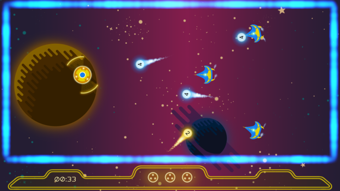
In-game footage of UI.

Hello Hanna, Julia from team Hippocampus here!
I think your blog is very easy to read. You have structured it very well, and I thourougly enjoyed reading about your progress.
I’m impressed that you’ve explained everything so thoroughly, and it feels like you’ve really thought about everything. You seem very councious about all aspects regarding your design, you’ve defined everything around your target audience, which I feel is admirable. Personally I sometimes get lost in other thoughts, but I strive to design in the same thought process as you. Your blog was actually quite inspiring, and mature in a way. You know what you’re doing so to speak.
Personally, I would like to read about wether or not you encountered any problems while working and how you solved them, or if you had any different ideas for how the UI could look. I think it would bring another interesting aspect to your blog post. Other than that, great job!
Your design decisions sounds intuitive in the context of this blog and how you represent your decisions. For a person without background knowledge about this project it can be hard to judge the “wiseness” or “goodness” of decisions and how it affects the project as a whole. This is because information usually inevitably becomes to some extent hand picked when constrained in the context of a blog post. For readers interested in the design it is interesting to access background documentation for the project (maybe a blog post in itself or just a link to a document), with information such as the target audience, the aesthetic goals, the reasoning behind these and other variables and constraints for the project.
The structure and readability of the blog post itself could be improved. Possibly with more highlights in the texts and more images throughout the post. (UI design in itself.)
A suggestion for what I personally think would be nice is if the various iterations of the UI would be shown in images to visualize how the UI evolved to your reading audience.
Side note: Everyone loves Gif’s. If you figure out how to make animated gifs of the game or UI, it could add to the already professional impression of the blog.
Heyo,
First off, I think this post express well the process you went through while designing this UI well.
You explained well what you aimed to achieve and how you achieved it.
I can see that there has been some research being done before designing the UI.
Research definitely is important when approaching any subject and it really helps in taking decisions toward them.
And also this post shows well that being analytic is very useful when designing anything. Dividing the whole into different aspects definitely seemed to help the process. And I’m learning from that since I usually try to think about everything at the same time.
Something I would have liked to see however are some links for the documentation you used when designing this UI. Per example the one about colour blindness (however I know that if I want to I can simply do the research myself) or the influences of your work if there are any.
Keep up the good work!
Hello Hanna! This is Tove and I am commenting on your blog this week.
I would like to say that I find your blog, your artwork and your way of working very inspiring. In fact, I am not sure if I have anything to point out that you should improve here.
First of all, you have written your blog in a pedagogical way that makes it useful to anyone taking the game design course. I found your highlighting of what makes a intuitive UI useful and interesting. The end result makes me as a viewer draw my attention to where I should and I really think you succeeded to nail down the points of what makes a UI readable.
It would be interesting to know more of how you create your graphics for the game, but maybe you have went into that in earlier posts. I will make sure to pay your blog visits again.
Best of luck with your game!
Tove